YOON SEYEOL
EXHIBITIONS
Chronic Compulsions at The Private Museum


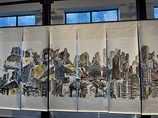


This year during Singapore Art Week, I visited The Private Museum with friends and encountered various works by local artists. This exhibition showcases contemporary works from Art Addicts Anonymous. Every works were categorized from Chinese paintings, colonialism and feminism. These artists created so much effort as they were selected, showed huge appreciation and presented to the public.
When I entered the museum, it felt cozy and lighting inside the exhibition was bright enough. It gave enough spotlight to each artworks. The room inside wasn’t too dark and all artworks made had a depth in storytelling and concepts. The mood was bright but has a warm feeling towards each piece. Not only the it felt warm, it also made viewers so focused on viewing the work.
The space felt very formal and professional. The paintings were well placed beside each other on every floor. However, there were few artworks that looked disconnected from each other. For example, the Lego Series were scattered across every exhibited areas. They didn’t present well to the seriousness or calm of the landscape artworks. The curation was supposed to be about exploring diversity of experiences and there was a gap of presenting emotional intensity.
Other than that, we also discovered the absence of labels. They used an online map to view descriptions and titles of various pieces. It was quite inconvenient as we had to go through every spot to scan the link and had to zoom through the map for descriptions. It would’ve been better if there was individual QR codes per piece or stick with normal label.
After viewing the exhibition I went back to go through the website and it was convenient to find any basic informations. However there was only exhibition information and the date of curator’s talk. It would’ve been nice if there’s few images of work displayed with artist’s information on it as well as explaining key points about the exhibition. It can create many visitors feel amused to make a trip there.
It was located at 11 Upper Wilkie Road and was further away from the bustling area which can be unfamiliar to others especially me. However, the ambience around the museum was quiet and there was a park beside. I can come by again to walk around the area to feel its quietness and view artworks too.
Ozer Toraman: The Ocean In My Heart at 39+ Art Space


This exhibition was held in 39+ Art Space from 19 January to 14 April 2024. Ozer Toraman (b.1989) is a painter based in Istanbul and Berlin and he is known for expressing landscape and portraiture. Traveling is part of his inspiration, creates work that can lead to another realm and deliver viewers to convey personal experiences onto each scenes.
In this exhibition, each of Toraman’s paintings were referenced from photographs taken globally and combined the landscape looking imaginative with figures on it. Recently, he attempts to depict on his own travels and connection with the ocean. He mostly uses blue to ‘dream without limits’ and briefly looks into a dreamscape.
The moment I walked inside the gallery it was serene and relaxing. It suited well with Toraman’s paintings as his works aren’t just imaginative but also meditative as well as color tones and its contrast. It felt like diving inside the piece and all his works were clean and it reminded me of David Hockney’s pieces. It was a pleasant experience but something that paid attention from my point of view was the way Toraman was trying to convey. It felt unclear and kept questioning what’s good about portraying ocean, grassy vibe and beach. Also what does the artist want the viewer to feel?
There was no explanation on each piece and I asked the gallery staff about it. They mentioned that the purpose was to make viewer to interpret on their own. Secondly, it’s a private gallery only for sale and it’s not for educational purpose. It’s understandable but it would be convenient to put a description on it for viewers to show sincerity. Also, viewers can interpret what they feel about the work but labels needed to be included to understand what Toraman was trying to talk about in each work. There was a booklet that contained simple description on the artist and what the exhibition was about including labels on each works. It felt missing and should’ve placed a brochure to know more on artist’s idea, his motif on doing this painting and every process starting from photography to painting. The gallery could’ve conducted an artist talk as there was anything on that from the website. How can we tell if it’s at Venice and Berlin? The gallery could’ve provided clear explanation even though it was imaginary surreal.
Overall, it was a meditative experience to feel the dreamy atmosphere of the painting and details were on point. However, it was less appealing and the concept needed to be stronger than just showing good visual. Also, the gallery needs to be more active on supporting artist’s solo exhibition such as conducting a talk from the artist, creating a brochure and proper labels.
© 2024 by Yoon Seyeol. All Rights Reserved.